Creating a Booking Application with Webix UI

This article would be interesting for those who appreciate their time and don’t want to spend eternity on a meticulous study of native web development technologies. No doubt it’s useful to know and understand how they work, but in the modern world, the technologies are developed so rapidly that keeping up with all the subtleties isn’t an easy task. If you don’t want to waste your youth on reading yawny documentations that will change tomorrow, you can use ready-made solutions.
One of the best solutions is offered by the Webix team. In this article, we will look at their library of UI components.
As an example, we will create an application for searching and booking air tickets. The summer vacation season is just around the corner, so this choice is more relevant than ever.
You can find the full source code here.
Webix UI and its capabilities
Webix UI is a JavaScript library that allows you to create a responsive design and ensure the high performance of your application. The range of possibilities is presented by UI components of varying complexity, from a simple button to such complex solutions as Report Manager, with which you can create and export reports of any complexity. In addition to the components, the UI library provides many extra options for working with them. For example, event handling, methods of working with data, interaction with the server, styling themes and much more. You can find out more information about capabilities in the documentation. Now it is time to move on to the practice.
Source of UI Magic
The Magic doesn’t happen by itself. In order to use it, you need to know the spells and possess arcane knowledge. It’s time to lift the veil of secrecy and make this knowledge available to you, not only for those enlightened.
So, to start using the UI library, we need to get the necessary files (they are the sources of the Webix magic). To do this, go to the Webix download page, enter the required data and get a link to download the desired zip file. Download and unpack it. Inside you will find the “license.txt”, “readme.txt” and “whatsnew.txt” files, which may be of interest to those who like to dive deeply into the study of the issue. In addition, there is the “samples” folder where you can see the examples of useful things that are created with Webix UI.
Most of all we are interested in the contents of the “codebase” folder, namely two sacred files: “webix.js” and “webix.css”. In order for the Webix magic starts working, we need to include them in the index.html file of our future project:
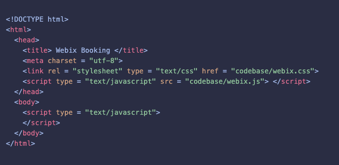
Inside the code we include the <script>…</script> tags, where we’ll build our application.
However, it is not necessary to download the archive with the library. The required files are also available via CDN. You can connect them as follows:

Initialization
Let’s start working with Webix.
All Webix magic happens inside the webix.ui() constructor. We need to make sure that the code starts executing after the HTML page is fully loaded. To do this, wrap it in webix.ready (function(){}). It looks like this:

After creating the index.html file and connecting the necessary tools, it’s time to move on to the development of our Booking application. So let’s start with the interface.
Create the Booking application
The interface of our application consists of the following parts:
- Toolbar
- Search Form
- Datatable
- Order Form.
We develop and store each of the parts in a separate file, and group them in the index.html file. Let’s start by building layouts that define the way elements are positioned on the page.
Layout
To fill the page with content, we need to describe the required elements in the JSON format. Let’s create a layout for our application and add new components there step by step.
For working with layouts, there are such entities as rows and cols, with which we can divide the page into rows and columns. They are separated by borders. Each of these properties has an array, inside which we can place other components.
First, let’s divide our layout into 2 identical rows. To do this, use the rows property:

Now the layout looks like this:
We can put any HTML content into these containers.
The top row of this layout will contain the Toolbar. The lower one will consist of 2 modules that will replace each other:
- Flight search module
- Flight order module.
Let’s start with the Flight search module and divide it into 2 columns. The left column contains the search form and the right one contains the data table. Therefore, we use the cols property:
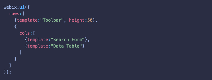
Now the layout looks like this:
By default, the containers fill all the available space. If we create two containers, we will get 2 identical parts. To set the desired size of the element (container for now), we can use the self-explanatory width and height properties.
Now let’s move on to the flight order module and also divide it into 2 columns. We will put the order form in the left column and leave the right column empty. You can ask me why. The answer is simple: if we don’t do this, the form will stretch and fill the entire screen, which is not aesthetically pleasing that much. An empty component, aka spacer, helps to align components in the interface. After that we can set the required size of our form and the extra space will be filled with this “invisible component”, so to speak.
Here we also use the cols attribute. It’s worth recalling, that the components inside cols and rows are separated by a thin gray line by default. We don’t need such a separator between the form and spacer. Webix allows us to manage it using the type property:

The result would be as follows:
We have created separate layouts for the flight search and flight order modules. Now we need to make them replaceable. As you may have guessed, Webix provides this functionality as well. It is possible using a multiview component.
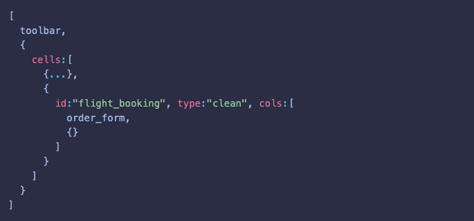
To do this, we need to include the necessary modules in the array of the cells property and assign them the appropriate id. It is worth mentioning that the app will display the flight search module during the initial loading. This module is specified as the first element of the array. How to change the modules we will talk about a little bit later.
Now our code looks as follows:

We already know how to work with layouts. Now it’s time to develop the components interface of our application.
Toolbar
The toolbar is an essential part of any application, which includes management tools and other goodies. In our case, the toolbar has only a dynamically changeable label.
In the toolbar.js file we create a component using the following line:

We save each major component in a variable to refer to it later in our layout.
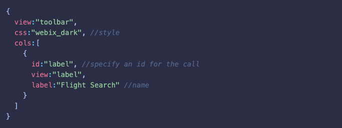
As you can see, the type of the created component is determined by the value of the view property. In our case it is toolbar. Let’s specify the style of the component and its label:
As we mentioned above, to include one component into another we need to use the rows and cols properties
Therefore, we include the label component into the cols array of the Toolbar component.
The id property is used to refer to the element. It must be unique. In our case, we use it to change the label. But we’ll get to that.
In this way, we have created the toolbar of our application. To use it in our layout, we need to include the toolbar.js file into index.html and put the variable in the rows property instead of {template:“Toolbar”} :

On the browser page we will see the layout with the toolbar interface:
It already looks good. Now it is time to move on and create the flight search module. It consists of 2 parts:
- Search Form
- Data Table.
Let’s take a closer look at them.
Search Form
We need to create a search form to filter the flight data. Let’s figure out what parameters we should use in this form and how to implement it in practice.
A classic form can be created using the <form> element. Inside this element, you can define the necessary controls. In this case, you need to operate with a large number of tags and attributes. Data processing requires almost a doctorate.
Webix offers to do this much easier.
Let’s create our form in the search_form.js file using the form component:

We will define the necessary controls inside the elements property:

As you can see, we define form elements inside of the elements array. Let me remind you that each component of the UI library is described using JSON. Let’s find out what the Webix UI library can offer for working with forms.
The Webix form has many benefits. It allows us to set or get the values of all the fields using only one method. We can also connect the form with other components or save data directly to the server. To learn more about working with forms follow the link here.
So now we need to decide which elements we need to implement. To select departure and destination points, we need to create special selectors. We will also look for flights by departure and return date. The return date control should be hidden and displayed as needed. Let’s do this with the “One Way” and “Return” radio buttons. When searching for a flight, we need to consider the number of the necessary tickets. To do this, we define a special counter. And of course, how can we do without the “Reset” and “Search” buttons. As a result, our form looks as follows:
Now we can go ahead with our plans.
Radio Buttons
At the very top of the form, we need to define the radio buttons with which we show and hide the return date selector. This is done using the radio element:

The values of the radio buttons are set through the options property. Besides, we specify the label of the component through the label property. The name by which we receive the value is specified as the name property. By default, we look for flights in one-way only, so we need to set the value of this particular option.
City Selectors
To specify the departure and destination points, we need special selectors. Let’s create them using the combo element:

Sometimes we need to tell the user what to do with this or that control. And here the placeholder property comes to help us. The placeholder gives a hint on what the user should enter. When the user enters or selects the necessary data, but then suddenly changes his mind, and it happens quite often, we can give him a chance to clear the field with one click. To do this, set the clear property to “replace”. Now, when the field is filled, the “clear” icon appears on the right part of it. When you click on this icon, the field will be cleared.
When the user clicks on the selector, it will show the drop-down list with city names. Let’s implement it. The data for the list of options are set through the options property. There are several ways to load data into the Webix components. We can specify them as an array directly, or we can store them in a separate file and simply specify the required URL. The component will load data by itself.
But the fact is that we need the same data for several components. Loading data separately would be quite consuming. Webix solves this problem using the DataCollection entity. Inside of this component, we just need to specify the URL to load data from. The information is loaded once and is available for multiple uses. In our case, the data object is stored in the ./data/cities.json file. Let’s create a collection and save it to a variable for convenience:

Now the data are available for use in our selectors.
Above, we have described the departure point selector. The destination selector has minor differences, we will not dwell on.
Date Selectors
The schedule is one of the most important parts of modern life. When looking for flights, we have to take this into account. To give the user the ability to specify the desired departure time, we use the datepicker element:

When the user clicks on the selector, it shows a compact calendar in which he can select the desired date. Moreover, we can set the format in which the selected date is displayed in the selector field. This is implemented through the format property.
Let’s define the same selector for choosing the date of the return flight, but initially, we need to hide it using the hidden property. This selector is displayed, when the user clicks on the “Return” radio button, but more about that later.
Ticket Counter
Imagine a situation where our potential user is going for a long-awaited vacation not alone, but with the whole family or a group of friends. In this case, he needs more than one ticket. It would be nice to let him set the desired number of tickets. We can do this using the special counter element. It is very convenient to use it. On the right and left parts there are icons with the plus and minus markers, with the help of which the user can increase or decrease the number of tickets. It is also necessary to set the minimum value through the min property so that the user cannot set less than one ticket. The element code looks as follows:

Buttons for searching and resetting the form
So the user has set the search parameters and fill in the required fields. Now we need to create the buttons to allow him to start searching by the specified parameters or clear the form.
For this, we need to create the “Search” and “Reset” buttons. So let’s define them using the button element. We specify the name of the buttons through the value property and add styling through the css property. Here it is necessary to clarify that the library provides built-in styling of buttons. We use the built-in “webix_primary” class to style the “Search” button. To learn more about styling buttons follow the link here.
For convenience, we place our buttons in the form of columns:

We have created the interface of the search form. Now let’s integrate it into our layout. Bet you do remember how to do it? To do this, just like in the toolbar example, we need to include the search_form.js file into the index.html file. As you remember, the form interface is stored in the search_form variable. We use it in the layout as follows:

The application interface looks like this:
Flight Table
The user has entered the data, clicked the “Search” button and expects to see the result. And the result is displayed in a special table. Let’s create one.
It is difficult to overestimate the capabilities of the Webix table. Its functionality varies from displaying, filtering and sorting the data to exporting to PDF and Excel. We can write a whole book about its capabilities, sell it and make serious money, but at the moment we are more interested in how to configure the table just to our current needs.
Let’s create our table in the datatable.js file using the datatable component:

After this, we need to load the data into the data table. In our case, the data are stored in the ./data/flights_data.json file. One of the advantages of working with a Webix table is that we can simply specify the path to a file or script and the component makes a request, loads the data and displays it for us. It’s easier just to do nothing at all.
The path to data must be specified through the url property. For convenience, we store the path to the flights_data variable and assign it to the url property.
We have loaded the data. So now we need to display it correctly. For very lazy programmers, Webix provides such property as autoConfig. If you set this property to true, then the data will be automatically arranged in the corresponding columns.
But we are not yet lazy enough to use such tricks. Moreover, the process of setting up the columns manually promises us a lot of fun and useful features. Let’s take a closer look at them.
The configuration of the columns happens in the array of the columns property:

To load the data from the file into the corresponding column, we need to specify the id property. The value of this id must coincide with a key that stores the relevant data in the file.
To specify the header of the column, it is necessary to use the header property.
Often there are situations when the data comes in one form and we need to display it in another. It would be ridiculous to assume that the Webix developers did not take this into account and solve it in advance. Therefore, we can use the format property.
If we have already touched up on data changing, we will learn a bit more of it. The question is relevant for us because there are some columns where we need to apply formatting. We are talking about the dates and names of cities.
Let’s look at the example with dates.
The point is that the date values are stored and loaded as strings like “2021–03–26”. As you know, operating with the string date is not a very pleasant experience (sometimes, even painful). Based on this, we can immediately convert strings into JS Date objects during loading. Using the scheme property we can redefine all the strings of the specified field (which data are loaded into the column with the same id) into the corresponding Date objects before loading them into the table:

Now the date values are loaded into the “Date” column as objects. Converting makes filtering much more convenient. But it doesn’t end there. We need to configure their display in the cells of the column. To do this, we use the already mentioned format property in the webix.i18n.longDateFormatStr value. Now the Date object is converted into the given format and displayed as 26 March 2021. That’s the kind of magic.
The columns that display the names of the cities also deserve our attention. The fact is that the data of the departure and destination points are stored and come as numbers. Why make it so difficult? The answer is simple. The city names are stored in a separate server table as id — value pairs. The flight data contains only the corresponding ids instead of names. To get the name of the city by its id, we have to use the collection property.
Let me remind you that when developing the city selectors, we created the data collection and saved it in the cities_data variable. The beauty of working with collections is that the data are loaded 1 time and can be reused in different components.
So, the collection property sends a request to the cities_data collection and gets the city name by its id, which corresponds to the value of the column cell. There is nothing more to add here. Such little things like that make the development process a play.
But it is not a time to relax. Now we need to imagine that a potential user has entered the data into the search form, clicked the “Search” button and found the required flight in the table ( now we just need to imagine it). What is the next step? Of course, we need to help him to book the flight as soon as possible. How to do it?
For the convenience of booking, we create a button at the end of each row. When clicking on the button, the user will go to the order form. But not a word more. All the interaction will be in the second part of the article, where we will breathe life into static interfaces.
If you are interested in the capabilities of the table and the column configurations, follow the link here to get more information.
We continue to customize the data table.
Our user has found several flights (10, 100 or more) that match his requests. We need to help him to find the desired flight directly in the data table. Let’s create a search bar and arrange it above the data table so that a potential user finally finds his flight and tells his friends about our cool service. For this we use the search component:

This is a text field with a nice search icon.
When everything is ready, we need to integrate the components into our layout. The code looks as follows:

The result in the browser looks serious:
Order form
The user has found a flight and he is ready to make an order. Let’s help him do it. It’s time to create the order form. It is displayed instead of the flight search module when the user clicks on the “Book” button in the data table. The form looks as follows:
In order to implement this functionality, let’s use the form component and write the following code:

Now let’s describe the elements we need.
Input Fields
To make an order, the user has to fill in his data. To do this, we create the appropriate input fields. Fortunately, the UI library provides such an opportunity and has additional magic for its implementation.
Let’s use the text element and its advantages:

Unlike the search form, here we need to add validation. Personal data are a serious thing and the user can’t confirm an order until he enters the data correctly. Let’s consider a scenario where the user doesn’t enter personal data or enters it incorrectly and sends it for processing. What should happen next? That’s right, the data must be verified.
Webix anticipates such situations and provides a ready-made solution in the form of the rules property and also provides conditions for validating the entered data. Of course, you can write these rules yourself, create several functions, read a couple of books on regular expressions, take courses on their application and return back to the built-in rules, because they are really convenient. All you need to do is assign the rules to the corresponding names (name properties) of the form fields in the rules array:

If the field value matches the set rule, the form allows further actions. Otherwise, the fields are highlighted in red. But the red boxes don’t tell the user anything specific. He understands that he does something wrong, but he doesn’t understand what exactly we want from him.
Webix has a good solution to inform the users about wrong validation. It is implemented through the invalidMessage property. For each field, we can set a message that appears in case of incorrect data:

It seems that Webix has ready-made solutions for all occasions. But you need to remember that this is just the UI library and real validation should happen on the server.
Counter
In the search form, our user has set the required number of tickets and clicked the “Book” button opposite the required flight. After this, the app displays an order form where he can confirm it. But our user suddenly decides to order not 2 tickets (as he indicated in the search form), but 3. Let’s give him the ability to change the number of tickets right in the order form.
To do this, we use the already familiar counter element. In fact, it is the same as in the previous form. Its initial value depends on the value of the search form counter and the number of available seats on the selected flight. With its help, the user is able to change the number of the needed tickets without going back to the search form:

Checkboxes
Each of us at least once has used the services of airlines and knows that you need to pay for extra baggage that doesn’t fit into your allowed carry-on baggage. In addition, if the flight is long, we will give the ability to include the cost of food in the ticket price. Let’s see how to implement this.
To do this, we create 2 checkboxes “Checked-in Baggage” and “Food” and use them to increase the price for a ticket if the user checks these additional benefits. The checkbox is implemented using the checkbox element:

Through the checkValue property we set the value of the checked checkbox. In our case, for additional luggage and food, the user has to pay $15 and $10 respectively.
Radio Buttons
Now let’s move on to in-flight comfort. The “Economy” and “Business” radio buttons are dedicated for this. They are implemented using the already familiar radio element:

By default, we set the “Economy” class. When the user switches to “Business”, the standard price will double. Everybody has to pay for comfort.
Label
Good service is an informative service. That is why we need to display the up-to-date information about the order price. Let’s create an element to display the final price. This is implemented using the label component we are already familiar with:

The initial price is set when clicking on the “Book” button in the flight table. It considers the cost of the ticket and their number. When the user adds benefits or changes the number of tickets, the price will be recalculated automatically.
Buttons “Go Back” and “Make Order”
Our user has finally decided to make an order or changed his mind and wants to go back to the search form. Let’s make it possible. To do this, we create the corresponding “Go Back” and “Make Order” buttons using the familiar button element:

We have created the order form interface. Let’s put it in our layout:
The result in the browser:
We have described all the interface elements and created the layout. Now it’s time to bring our app to life.
Set interaction with the application
In the first part, we have described the layout and visual appearance of our application using Webix UI. But this is only the tip of the iceberg. Let’s liven up our Booking App and make it interactive. Previously, we have only assumed what would happen if the user did this or that. So now it is time to put it into practice, especially since Webix provides us with a huge set of tools to implement our plans.
Search Form
Radio Buttons
So, at the very top of the search form, there are the “One-Way’’ and “Return” radio buttons. “One-Way’’ is set by default. When clicking on the “Return” button, the hidden return date selector should be displayed. How do we do this? It is as easy as ABC. We just need to define a special handler for the event to switch between radio buttons. There are special properties for working with events. The most versatile of these is the on property. It is used to set a handler(s) for several events at once. It looks like this:
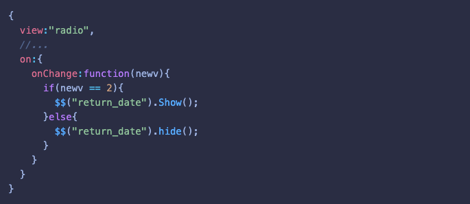
Now, when the user switches between radio buttons, the function will hide and show the return date selector. This is done using the show() and hide() methods. The names of these methods speak volumes. You can refer to the desired component via the $$() method, which takes the ID of the component as a parameter.
City Selectors
Let’s suppose that our user has selected Berlin as the departure point. After that, he goes to the destination selector and finds out that there is also Berlin in the list of options. Why did this happen? The point is that city data are loaded from one data collection. But the user is not interested in it. Let’s fix it.
The selected options in the selectors cannot be the same. To implement this we need to define a special handler that analyzes the selectors' data and excludes the option from a selector, if it is already selected in the other one. The handler will start to operate when the user opens the drop-down list:

For this we will use the familiar on property that allows us to set a handler for the required events. In our case, it is the onShow event. When the user clicks on the selector, the application will run the optionsData() function. The function filters and displays the list of available options for another component this handler is called for. It looks like this:

Here we use such handy Combo methods as getList() and getValue(). The first method gets the options list of one selector. The second one gets the set value of the other one. The filter() method filters the options list and excludes the selected city (obtained by the getValue() method) from it.
Now let’s move on to the “Reset” and “Search” buttons.
The “Search” button
Our user has entered the necessary search details and clicked on the “Search” button. The next step is to render all the matching results in the flight table. To do this, we need to handle button clicks. Let’s create this handler:

One of the many advantages of the Webix form is that we can get values of all the fields at once in one object. To do this we need to call the form’s getValues() method for the form. The received values are passed to the filter() method to filter the data table. The method rebuilds the table and populates it with the matched data. You can only imagine how much time it takes to implement such a functionality using native JS.
So, we have created the handler. Now we need to set it on the button click event. For such cases, the button component has the click property:

The “Reset” button
It happens that the user has already filled in the form, but he needs to clear it and start over, or he has already started searching and wants to return the data table to its initial state. Such a scenario is quite possible, and that’s where the “Reset” button comes in use.
It would be a good idea if we create an appropriate handler:

Using the clear() method, the handler clears all the form fields at once. But there is the ticket type field with the default value. We fix it using the familiar setValues() method. As an argument, we pass an object with the required value for this field.
Above, we mentioned the filter() method, with which we filtered the table data in accordance with the search details. If we call this method without specifying the search parameters, the table data will be displayed in the initial state. Everything is simple and clear. There is no need to create a lot of additional functions or reload the application. These methods greatly simplify the development process. All that is left now is to set a handler for our button:

We have done the search form. Let’s move on to the flight table and search bar.
Search Bar
As you remember, we have created a search bar that allows the user to search the data directly in the flight table.
To make the search bar alive, we need to create a handler that compares the entered values with the table data and highlights the necessary rows. First, let’s create this handler:
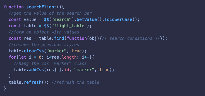
The function gets the value of the search bar through the getValue() method and compares it with the table data. This is done using the find() method called for the flight table. The rows, the values of which coincide with the entered data, are marked using the “marker” css class (the styles are in our css file). After this, we need to refresh the view using the refresh() method so that the specified css class highlights the matched rows.
Now we need to set this handler on the onTimedKeyPress event, to handle the entered values. This is done using the on property. The code looks like this:
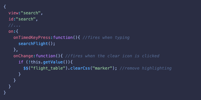
Apart from this, we set a handler on the onChange event. It fires when the user clicks on the “clear” icon and removes the highlighting from the rows.
Flight Table
At the moment the user can already search for desired flights via the search form, filter them out using the search bar and look through the results in the table.
As you remember, we have created the “Book” button opposite each flight, with which the user can proceed to the order form. Let’s see how we can implement this transition and what additional nuances there are.
Let’s start by changing modules.
When the user clicks on the “Book” button, the application will hide the search module and display the module with the order form. It should be recalled that when creating the layout we used the multiview component. Our modules are included in the array of the cells property and each of them has a corresponding id:

To change the multiview module, it is necessary to call the show() method for the desired module. To get access to the module, we use the $$() method and pass the required id as an argument:

We need to include this line in the body of our handler:

In short, the function receives an object with data about the chosen flight, sets the required values in the fields of the order form and displays the module with the order form.
The right time to introduce another useful method for working with a table is getItem(). This method returns the object of values of the table row, the book button is located on. From this object, we get the ticket price and the number of available seats. As an argument, the method gets the id property of the corresponding row.
As you remember, when describing the toolbar we determined that the label is replaceable. It changes upon module switch. This is done using the define() and refresh() methods.
The define() method allows us to define or change any property of the component and the refresh() method refreshes its visual representation:

Now we need to handle a click on the “Book” button. When creating a button we assigned the “webix_button” class and did it for some reason. Webix provides a special onClick property, to handle the click event on the table elements that are marked with one or another css class:

Now everything is working and the user can go to the order form.
Order Form
When the user clicks on the “Book” button, he goes to the order form. Above, we described how it is implemented. Now let’s see what happens directly in the order form. And we start with a costing system.
We set the initial price by clicking on the “Book” button in the flight table. The form takes into account the number of tickets and their price. When the user adds some benefits or changes the number of tickets, the price will be recalculated automatically. To implement this, we need to use the famed on property and handle the onChange and onValues events. The onChange event fires when the user changes any value in the form. The onValues event fires when the user clicks on the “Book” button:

The handler looks like this:

As an argument, the handler receives an object with form values, analyzes them and sets the final value in the “Price” label via the setValue() method. Unlike the setValues() method (which can set an object with the values for all form fields at once), the setValue() method sets only one value to the element it is called on.
The order price calculation is ready. The user adds benefits and the price is automatically recalculated and displayed.
So our user decides to make an order, enters the data and clicks on the “Make Order” button. In this case, we also need to create an appropriate handler:
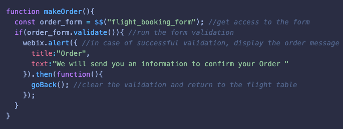
The function runs the form validation with the validate() method. This method parses the values of the form fields. As you remember, for each field we set the rule in the rules property. If the field values match the rules, the validation will succeed and the method will return true. Otherwise, the method returns false, the fields with incorrect data are highlighted in red and error messages are displayed below the fields. Let me remind you that we define these messages through the invalidMessage property.
In case of successful validation, the function displays a message about the order. It should be said here that Webix has several methods for displaying messages. We use the webix.alert() method, for which we can specify some actions. These actions are performed when the user clicks on the “OK” (in our case, this is the goBack() function):

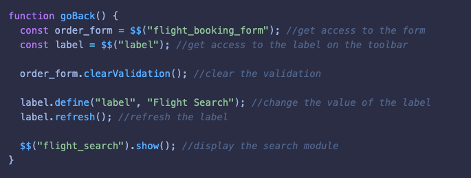
We also set the goBack() function as a handler to the “Go Back” button. The function clears the validation using the clearValidation() method, changes the toolbar label and also displays the module with the search form and flight table:
Conclusion
You can find the full source code here.
In this article, we have learned how to create the Booking application using Webix. We also learned how to work with layouts and describe UI components using JSON syntax. We touched upon some of the methods that allow us to work with data. As you can see, the components and methods are intuitive and easy to use. In fact, this is only a small part of everything that the UI library can offer. For more detailed information, you can go to the documentation, which contains a detailed description of all the possibilities with examples.
